
Before I talk about the covers, I want to make something very clear to aspiring authors who might be reading this. According to the self-publishing community, my covers are awful. They make for horrible thumbnails (the main way to sell these days), they are offensive, and they do not conform to the modern standards of what a mystery should look like. In terms of sales, the self-publishing community is correct.
My goal has always been to create the best-looking cover according to my tastes. I want something of which I can be proud. I’m not going to post images of the books of those who have criticized my covers, but, suffice it to say, their covers look like dogshit, perfectly designed-to-sell dogshit–I know what genre they are in half a second, the shrinking to thumbnail size does nothing to obscure the image, and they are inoffensive regardless of interior content–but dogshit all the same. The images themselves look like a poster in a teenager’s bedroom (somehow, even the erotica stuff)–infantilized, SIMS-looking garbage. I’m generalizing, but this is the average reaction I have to modern self-published covers.
I say this because I don’t want any author to think I know what I’m doing. I don’t. If you want to be successful, join Facebook groups to lurk and learn about book covers that sell. FYI
All my previous covers were images from (or at least inspired by elements of) the stories. The colors were deliberately muted in accordance with the majority of films and images from the 20s and 30s. There’s more than a little noir in my books and I thought it would be inappropriate to splash them with color.
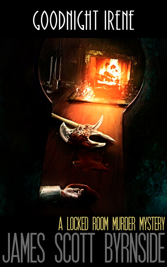
Goodnight Irene went through three distinct stages. 1. My DIY attempts. 2. Matt’s (my cover designer’s) interpretation of the story from hearing me vaguely describe it. 3. The final product.

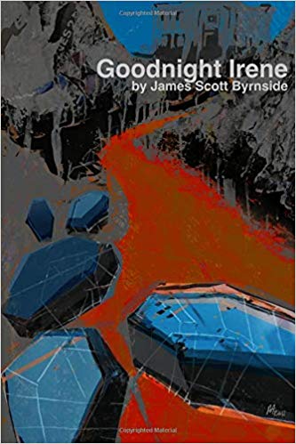
The size I chose was 6×9. It’s too big. But’s that’s what first-time authors do. They choose to make their books large because large must mean good. This was a mistake. Goodnight Irene should fit in the reader’s back pocket. That’s the kind of book it is.
Nevertheless, that’s the style we came up with for the Rowan Manory books and I am going to keep it. All those books will be 6×9 with the same (lack of) color palette and a matte finish. By the time the next book came out, Matt and I had developed a way of communicating. This turned out to be his least favorite cover, but I quite like it. It suits the tone of the book.
The 3rd book was a breakthrough. I included a mapback (courtesy of my friend Jean-Joel. It wasn’t perfect, but it had a down-home, folksy charm about it. And Matt’s cover was his best yet.

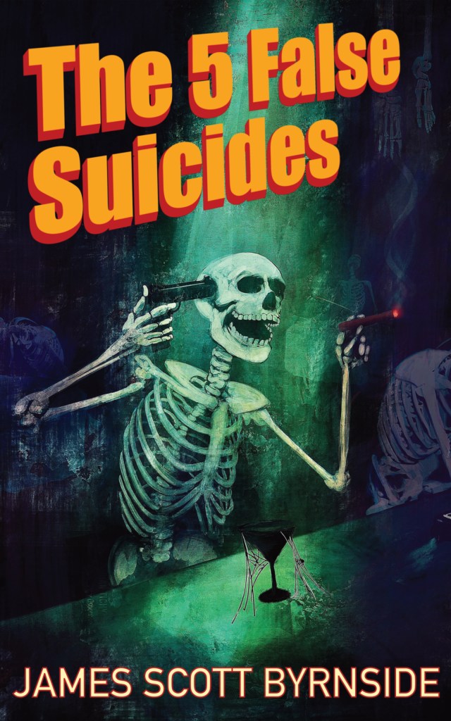
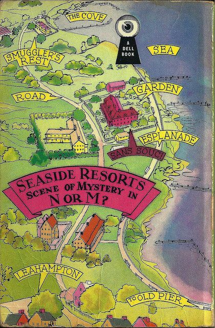
Those were all Manory/Williams books. For The Five False Suicides, I knew this was the chance for something different. First came the decision to make it smaller, more colorful, and glossy. I had recently purchased some first editions of Christianna Brand. The pop-art style of the US first editions was quite striking. Look at this one. See her name–the bubble lettering. I love the abstractness. It’s not a scene. I love the dominating color. And of course, the skeleton. Lots of skeletons adorn old-fashioned murder mysteries. Not so much anymore though.

But what would the image be?
Without getting spoilery, the idea was for the reader to finish with the final image and turn back to the cover understanding it perfectly. There would be a skeleton, pop-art elements, and a unifying color. Nothing about the cover would be indicative of events or characters within the story. There would also be a map and a diagram. Those were the rules.
I decided that the misdirection of suicide would have to be represented, but in a way that showed us that it was false. What better way than someone who is already dead?

I’ve always liked green on a mystery cover. The idea would be that this skeleton would be killing himself in multiple ways and bathed in green light. And yes, it would be laughing its ass off.
So, Matt and I discussed it while looking at hundreds of images


We very quickly decided there would only be one method of death. Having the knife, the rope, and the poison just crowded the image and took away from its power. We settled on the gun because there would be no mistaking the intention. As much as I told Matt there was no location (just a green wall and maybe a table or a desk), he ended up needing one. We decided on a dead bar. Believe it or not, this was a major breakthrough for him and he worked much faster after that.
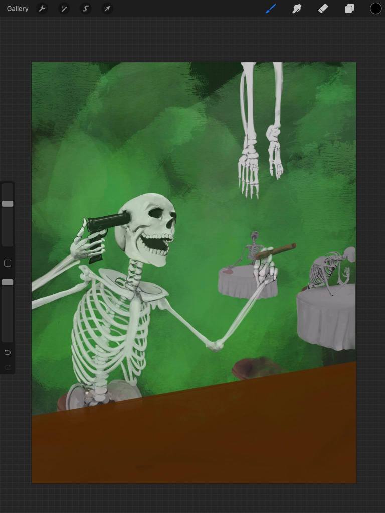
First the skeleton:

Matt worked very hard on the grip of the gun and the expression (if skeletons have such a thing) to make the image captivating.
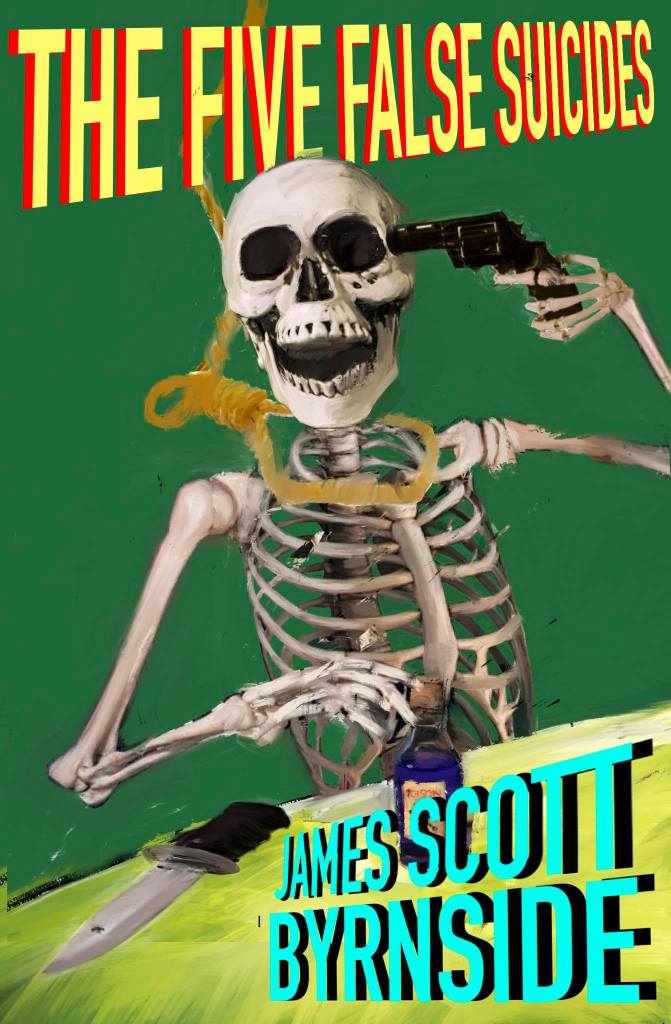
As he worked, I slowly got the feeling he wanted to ground it — the green would be tangible (a light source or smoke) the bar would take up more of the image, and there would be more skeletons.
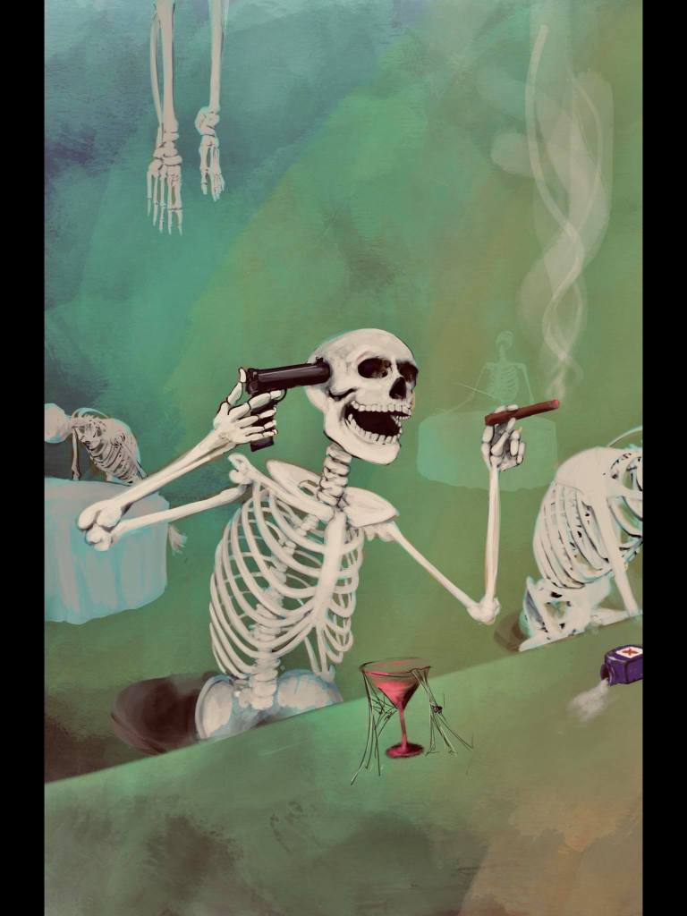

It all came together. As you can see, this is not Matt reproducing my image, this is him filtering my ideas into something artistic. That’s the goal. I don’t know anything about scale, or color, or design. He does.
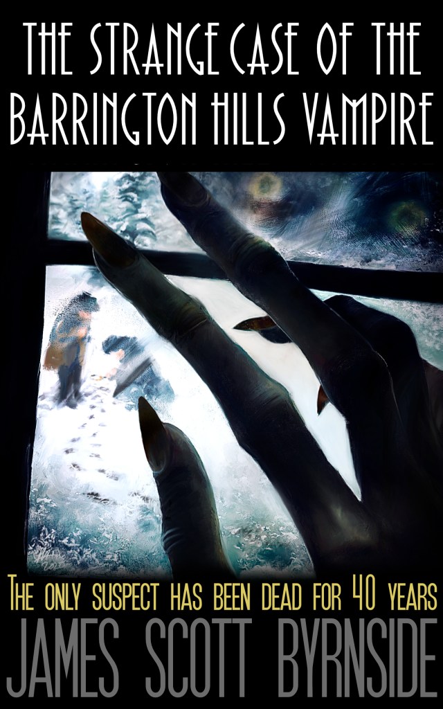
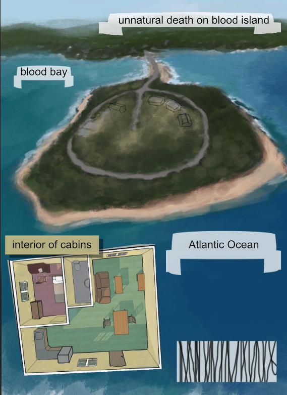
On The Strange Case of the Barrington Hills Vampire I had a different person design the mapback. I wanted a bit more unity this time around.
My idea was to have the island (showing who was staying in which cabin) and the interior of the cabin (showing the door to the bedroom).


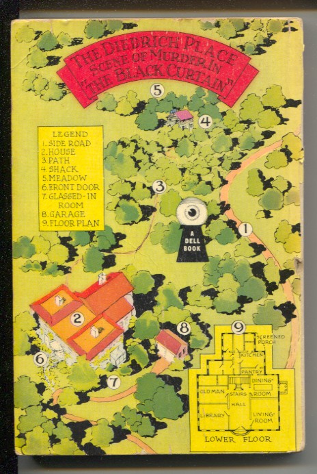
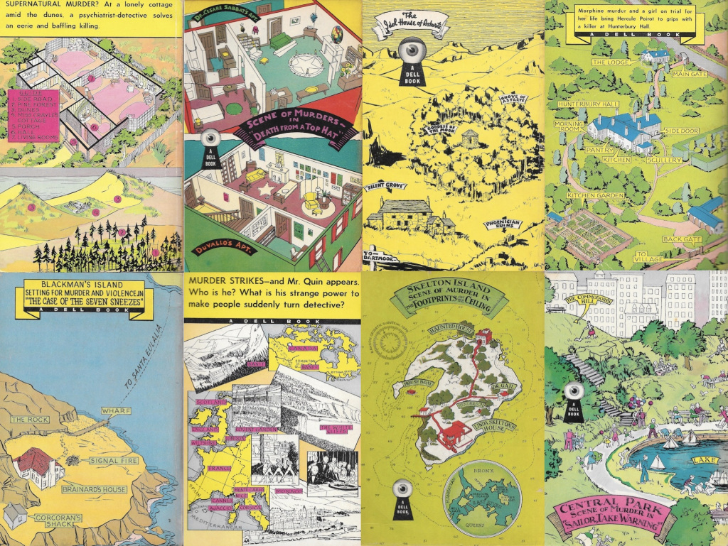
And of course, we looked at a shitload of Dell mapbacks.
Matt hated doing the map. He had trouble with perspective, scale, “texture”, color–everything really. Eventually, he came up with this. I liked it.

The last thing to decide was the spine. I love yellow and black, and since there ended up being more black on the cover (the green is a spotlight) and I wanted to pay homage to the Italians yellows, we went with yellow. The font was similar to the font on the spine of my Black Gat Books copy of Madball (a book whose influence on The Five False Suicides cannot be overstated.

So that’s it. Those are the choices Matt and I made along with some of the main reasons we made them. I hope you enjoy the end result.

You know, James, your book covers are rather great, IMO, terrible thumbnails or not. But bear in mind, I don’t give a fuck about communities of any kind, and I sustain generic covers are boring.
Why does every erotic novel feature a man strong enough to choke a bear, masculine yet elegant, savage but soft, dry-humping a girl of questionable age? Why the shitty, unreadable caligraphic font? If you write erotica you know you either do that crap or face backlash. Same with mystery, sci-fi, you name it. There’s a standard of mediocrity for everything.
See how everyone always copies the style of the bestselling novel, and I’m not just talking about covers, but quality of content. If you do that you might make it big, but most likely drown in a sea of a million shitty novels with a million shitty covers.
Anyone could write something like 50 Shades of Grey or the Millennium saga, and that’s the issue. Making it big like that is just like winning the lottery, a matter of chance.
And, what the heck even is a cover for an impossible crime novel? Are there any conventions I’m unaware of? There are only 3 or 4 nutjobs writing them out of unbridled passion (I’m one, I plan to release the first one in a few months and I was thinking about this very thing). So yeah, just keep on doing what you like and how you like it. Let the dogs bark.
LikeLiked by 2 people
Great news about releasing a book this year. Keep me informed.
TomCat over at Beneath the Stains of Time could probably give a better estimate of modern impossible-crime authors, but I’d be willing to bet the total number is a lot higher than you think.
LikeLike
Sorry for the late response, but yes, thankfully there are more than a handful of dedicated nutjobs writing them. Just take a look at Jim’s (JJ of the Invisible Event) blog-series “Adventures in Self-Publishing” or the “locked room mysteries” tag on my blog. However, the quality among Western writers is all over the place. Jim reviewed some particular lows (Steve Levi’s The Matter of the Duct Tape Tuxedo, Deb Pines’ Where’s the Beef? and Merapi Omnut’s The Message in a Bottle). And don’t skip the comments.
You’ll find more consistency among non-English writers like members of the shin honkaku school and (surprisingly) even some writers from my own country.
Anyway, The 5 False Suicides is on the pile and will get to it as soon as possible!
LikeLike
Just wanted to let you know that you can expect my review on February 11.
LikeLiked by 1 person
A always, I’m looking forward to it.
LikeLike
It seems like most modern covers feature no more than four colors. I suppose that leads to “big bold” art, where I can distinguish the books in the series based on whether it’s the green one, the pink one, or the blue one. It’s so limiting though with the imagery. Looking at the most recent Christie reissues, there’s the cover with the crude snake, the cover with the crude paintbrush, the cover with outlines of planes in the sky, etc. Contrast that with the lush paintings that graces the 40-60’s era Dell, Avon, or Pocket Books editions.
I can’t imagine the modern style is what book buyers actually want, but rather what they’re getting. I suppose if the book cover is mostly experienced as a thumbnail on an eReader, perhaps it doesn’t even matter. The only recent books that I recall seeing with amazing covers are the recent Brian Flynn reissues (which are based on original covers, I believe).
Anyway, I love the new cover. It’s crazy to see how far it came from your initial concept. It’s that greenish shaft of light that really does it for me – almost giving me the impression that the scene is underwater, which makes it all the more creepy. And the map back – got to have the map back.
I loved your comment about the form factor – yes, a mystery like this should absolutely fit in your back pocket. All of the modern day editions I have (the likes of LRI, Ramble House, Rue Morgue, etc) are way too big. Pushkin Vertigo has been going a bit smaller, but still not that classic form factor.
LikeLike