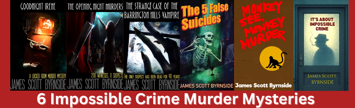
I’ve made it a habit to post about my covers after each book release. This will continue whether you like it (or indeed, give the slightest fuck about it) or not. There may be repetition of some things I have said in previous cover posts. Tough.

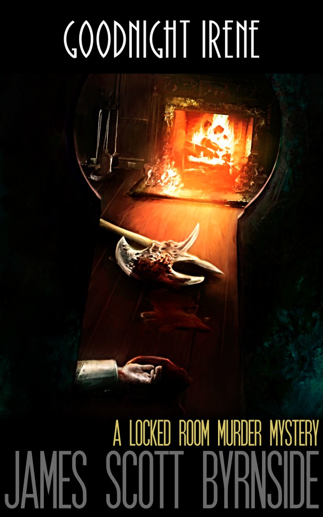
For a short time, I planned on making Goodnight Irene’s cover all by my lonesome. The above image was as far as I got before realizing that was an incredibly shitty idea. I made the picture on Canva.

This was Matt’s interpretation of the nuggets I had given him. I listed some of my favorite images from the book. He liked the coffins and the mansion in the background. The cover’s biggest drawback was that it gave no indication of the genre. More than one person guessed sci-fi.

After The Opening Night Murder’s cover was done, I wanted Matt to redo Irene with a proper murder mystery cover. I went for simplicity with a view through the keyhole. It made sense for a book about a locked-room murder.
Matt did this one rather quickly. The format, including the tagline, was set. I planned to have all my books look this way.

My drawing was meant to be giallo in nature–the gloved hand holding a razor and the woman in danger.
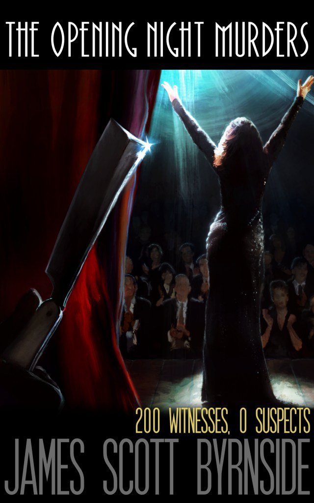
Matt and I spent much time talking about the gleams and the spotlight. My idea was heaven in front of her and hell behind. He played with making the curtain “bleed” from the razor. It’s subtle, but I like it. His wife was the model for the actress.
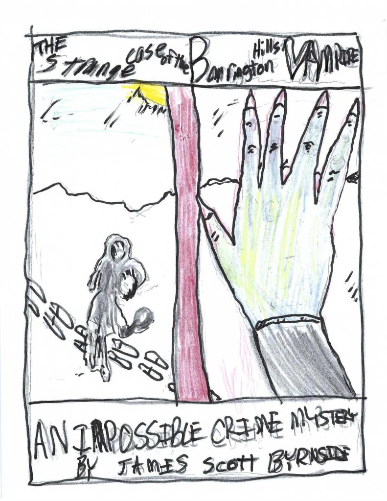
For The Strange Case of the Barrington Hills Vampire, I wanted to show the detectives for the first time. It was important not to focus on them, lest I ruin the reader’s idea of their looks.
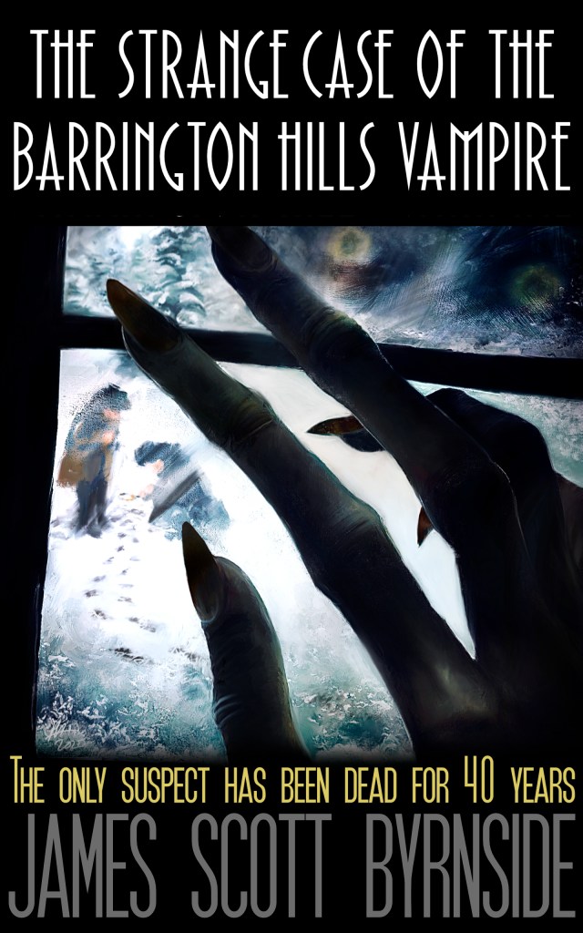
Matt has expressed regrets about this cover. I don’t have any. The frost, the reflection, the fingers, the out-of-focus detectives–it captured exactly what I wanted.

The back cover was my first attempt at a mapback. It was fun planning and orchestrating the project between two artists.

Jean Joel drew the original picture. Matt added a few details. He had to change the car! I have a lot of fond memories of this cover. It went smoothly and the results made me happy.

I was changing genres from more traditional mystery to pulp madness a la Fredric Brown. That meant it was time to change the cover style.
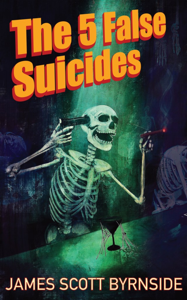
It was liberating for both Matt and I. It was also far more elaborate than any of the previous covers. Matt worked more on The 5 False Suicides than on any of the other books. The back was just as elaborate.


I wanted a map of the island and an inset of the cabins.

It’s Matt’s finest work in regards to my novels.

Breaking out of my typical form freed me from my self-imposed shackles. I wanted the title of Monkey See, Monkey Murder to be the most prominent aspect of the cover. The image was simple, the silhouette of a macaque in a police flashlight. In keeping with the alley theme, the title was meant to be like graffiti.
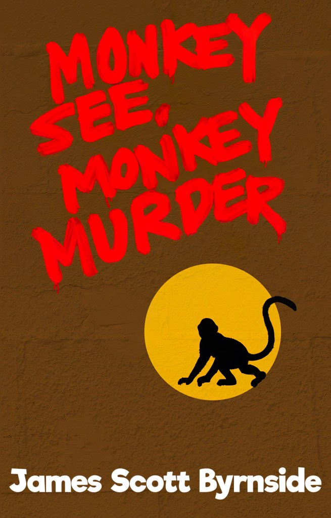
Matt did it in 2 weeks. It’s fun and engaging and it’s the simplest cover we’ve done. There’s probably a lesson, but it’s over.
What’s next? A photo. I haven’t decided what it will be, but I want Matt to take a photograph and manipulate it. He’s quite good at doing that. I’m thinking black and white, noirish. It will be a book of short stories comprising tales of the city. Bars and dark alleys. Lugs and dames. Maybe the photo will be a glass of whisky. Maybe the whisky will be in color and the rest in black and white. Maybe there will be some blood. We’ll see.

Enjoyed this, and ready to dig into the new story too.
LikeLiked by 1 person