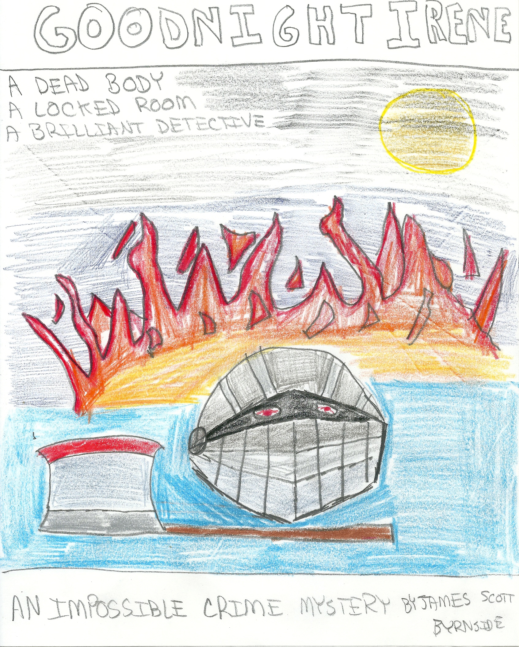
When it came time to make Goodnight Irene’s cover, I called on Matthew David Arthur Willis-Jones. We’ve been friends for twenty years, and I was well aware of his talents. Matt had been living in Oslo working on Hollywood movies (Batman Begins, Kingdom of Heaven) until he packed up for Mexico City.
I described the atmosphere of the book and sent him a few example covers. At that time, Matt was creating collage-like art pieces featuring trans women. You can see his work here. Without reading the book, he came up with this which is subtly similar to the style he was using for his own work.
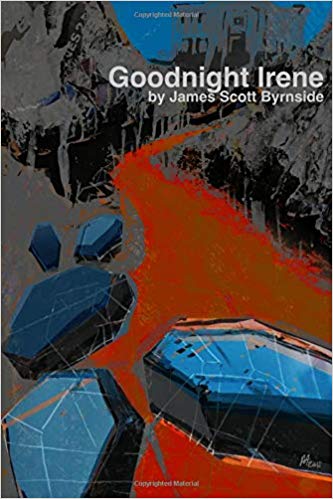
I was impressed. Without reading the book, I felt he had managed to capture its tone.
There was a huge problem with this cover — genre uncertainty. Most readers had no idea what they were looking at. Some people guessed sci-fi. They thought the coffins were pods from a spaceship.
In August, a gentleman approached me at an author fair. He pointed at the book and said, “Sci-fi?” It was then that I set about rethinking the design.
For The Opening Night Murders, I had two ideas. The first was more suggestive and creepy.

Matt liked this one, but I was worried. Would this have the same genre problems as Irene? For the alternate option, I went literal.
This is what we went with. The idea would be to represent the impossible crime in medias res. I meant it to be the best shot from the best Brian DePalma set piece. I even asked Matt to experiment with creating a diopter effect. The result was an eight-foot-long razor so we scrapped it.

Now the finished cover

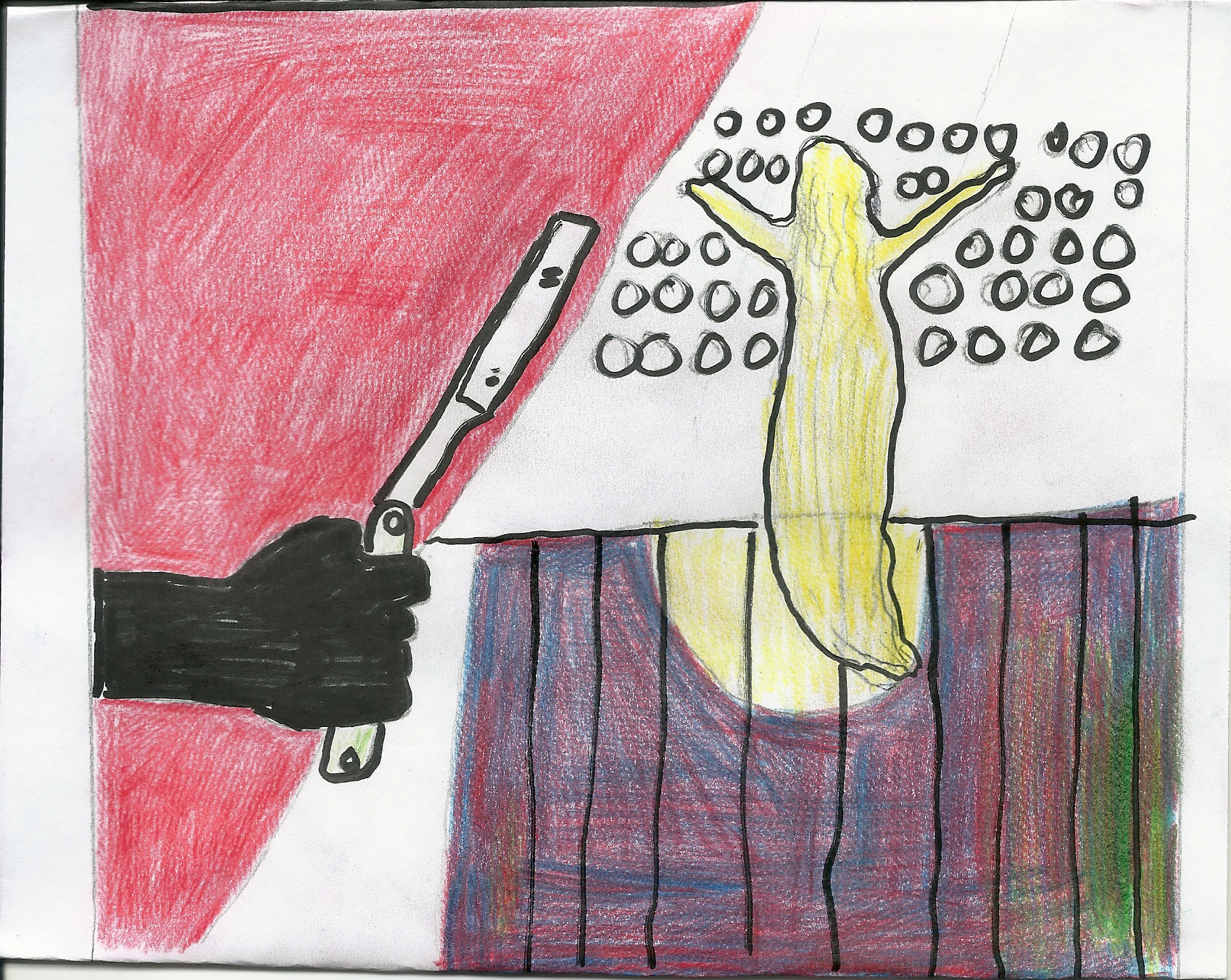
I came up with a lot of dumbass shit for Irene. Check this out.
I came to my senses and made something simple.
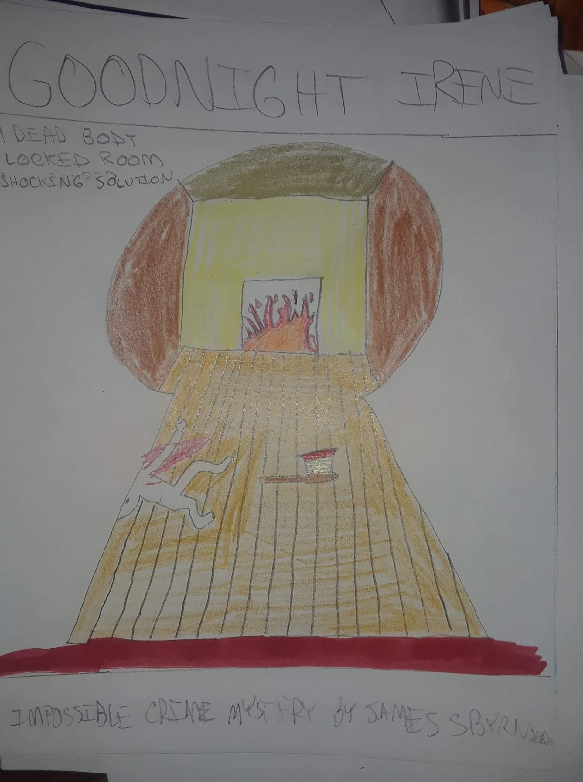
Matt added the canted angle and it really brought the image to life.
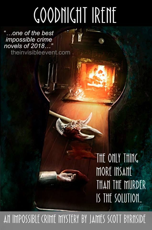
I was a little sorry to see the old cover go. I thought it beautiful. However, the new one highlights exactly what I have for sale. A dead body in a locked room. That’s going to be the case with all my covers — the impossible murder from the most interesting angle. Happily, the cover for my third book will be a change of pace. It’s going to be white. Snow white with a touch of red. And (don’t hold me to it) I’m really wanting to put a map of the main murder on the back cover. Matt’s excited, I’m excited.
By the way, I’m happy to report that Matt finally read Irene this year. He loved it. Unfortunately, he thinks the original cover was a perfect fit. Sigh.
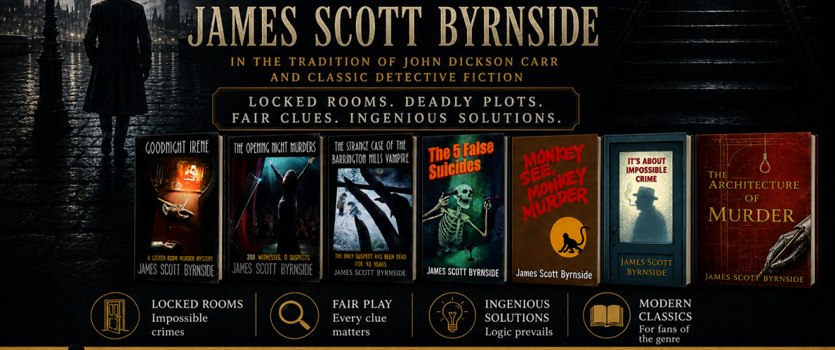
If you are an author in need of a cover designer, I would be happy to put you in contact with Matt. He is not familiar with book designing outside of his work with me, but if you give him an idea of what you want, he will produce something special for you.

Firstly, I do so love that original GI cover. Fine, it causes some confusion, but it’s great nonetheless. I love the new one too. Superb work by Matt, both of ’em.
Secondly, yes to the map on the back of the next book! A thousand million times yes!
LikeLike
The one problem will be the lack of a blurb. Of course, a well constructed murder map says so much more about a book than a blurb ever could. And I hate writing blurbs.
LikeLike
Well, it worked for Dell all those years, and the Ramble House edition of The Footprints of Satan has a map and no blurb and is perfect just the way it is!
LikeLike