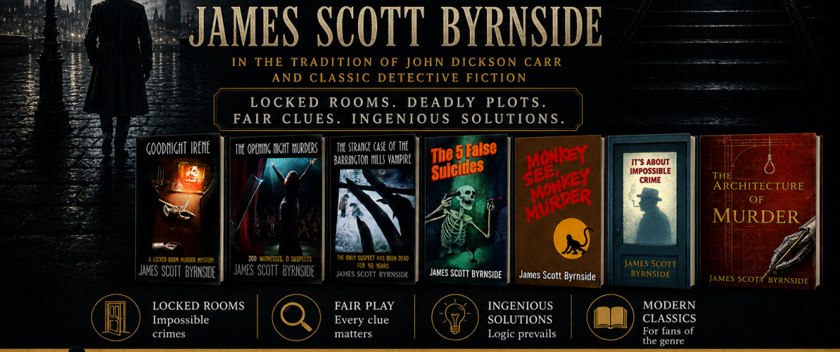
Since I started my blog, I’ve posted about the cover after every publication. This is the latest version. At the very end, I’ll tell you what might be coming next. If you’ve read my cover posts of the past, feel free to skip to the end.
My first novel was Goodnight Irene (2018). It was a country-house mystery. I gave my designer, Matt, free reign. (Smart) He made this. It’s quite good.
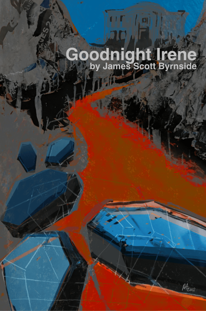
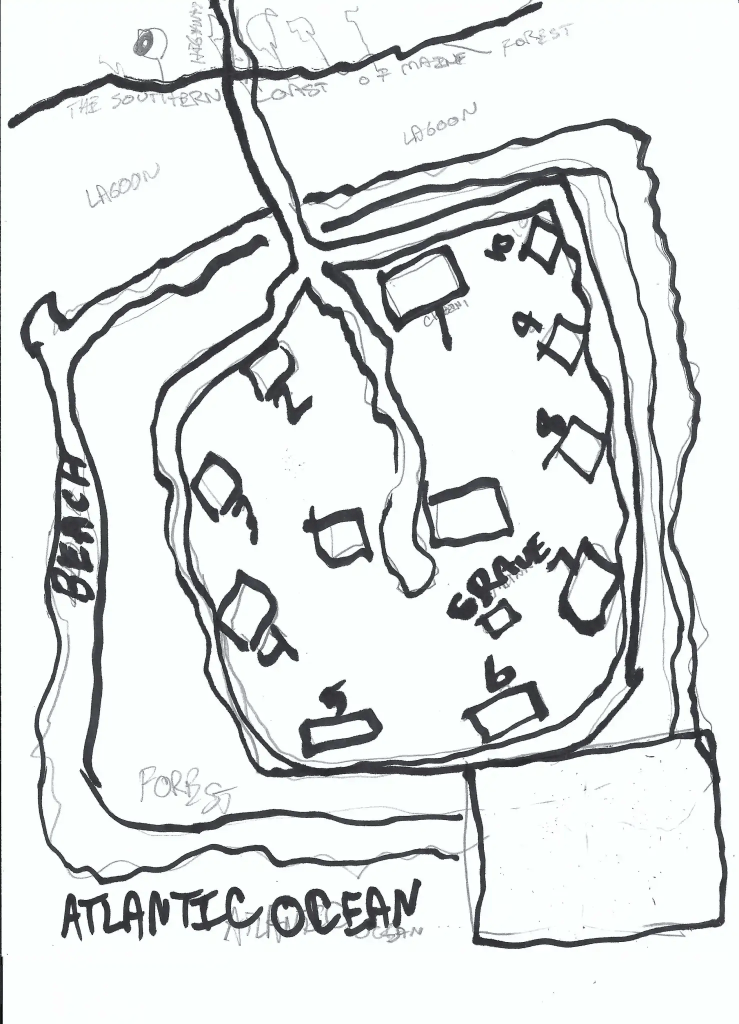
The problem was that no one knew the coffins were coffins and it gave a bit of a sci-fi vibe. We scrapped it. From then on, I drew a picture for Matt to make sure we were in the right genre.
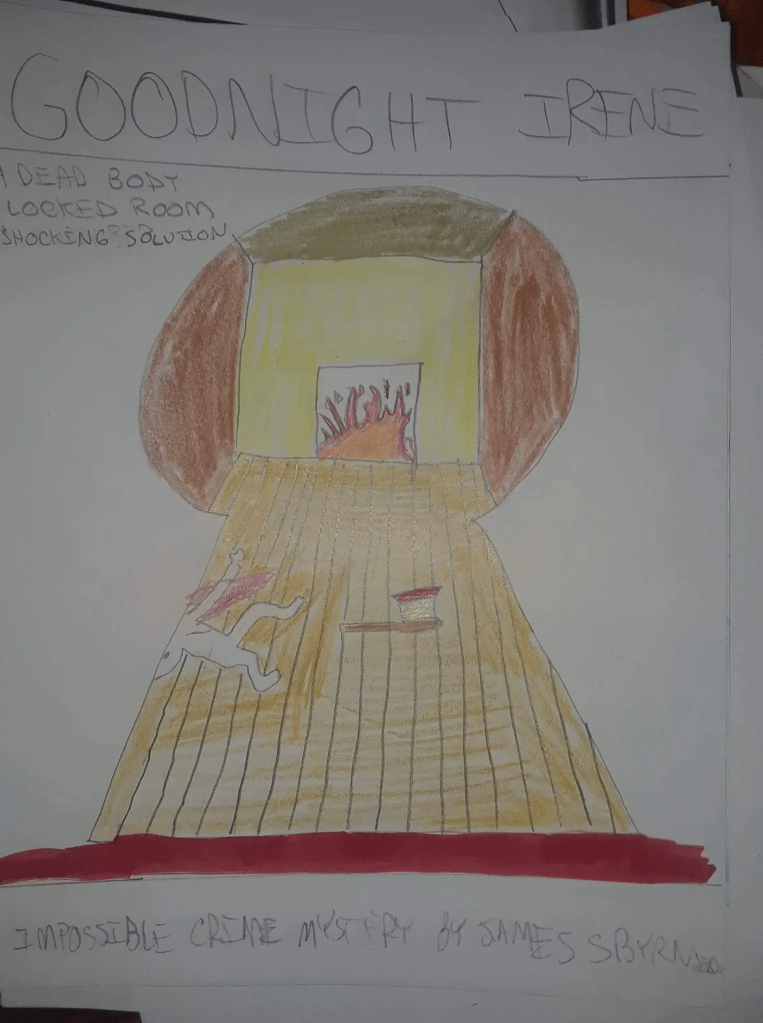

This is the “basic bitch” of my covers. It tells you what you’ll find inside.
My next book was The Opening Night Murders (2019), a noirish theatre mystery. This one was much darker, and the main image was the gleaming razor.
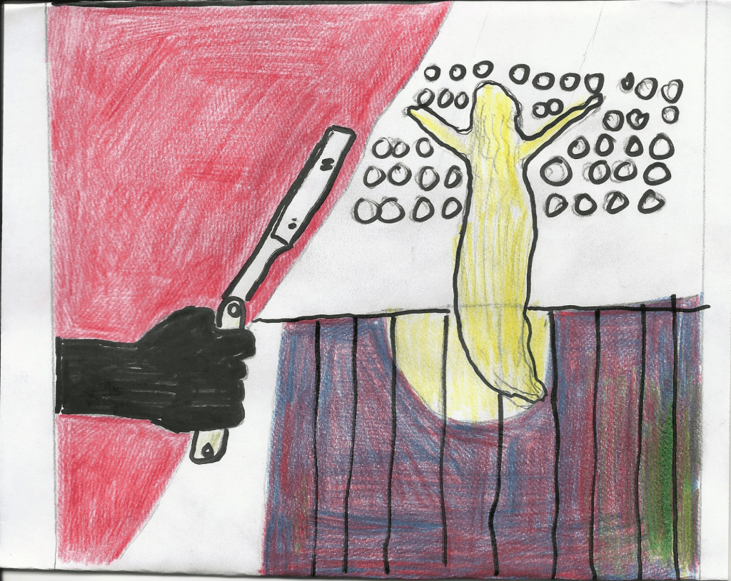
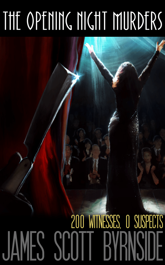
It’s my favorite of my books. Naturally, I’m fond of the cover.
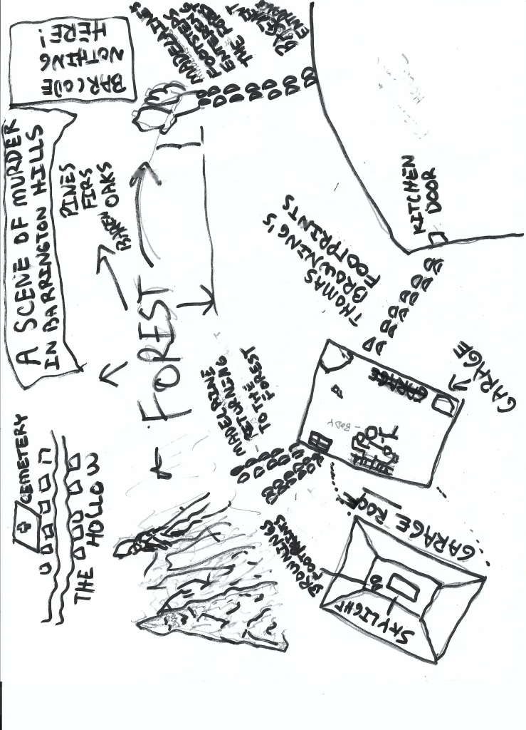
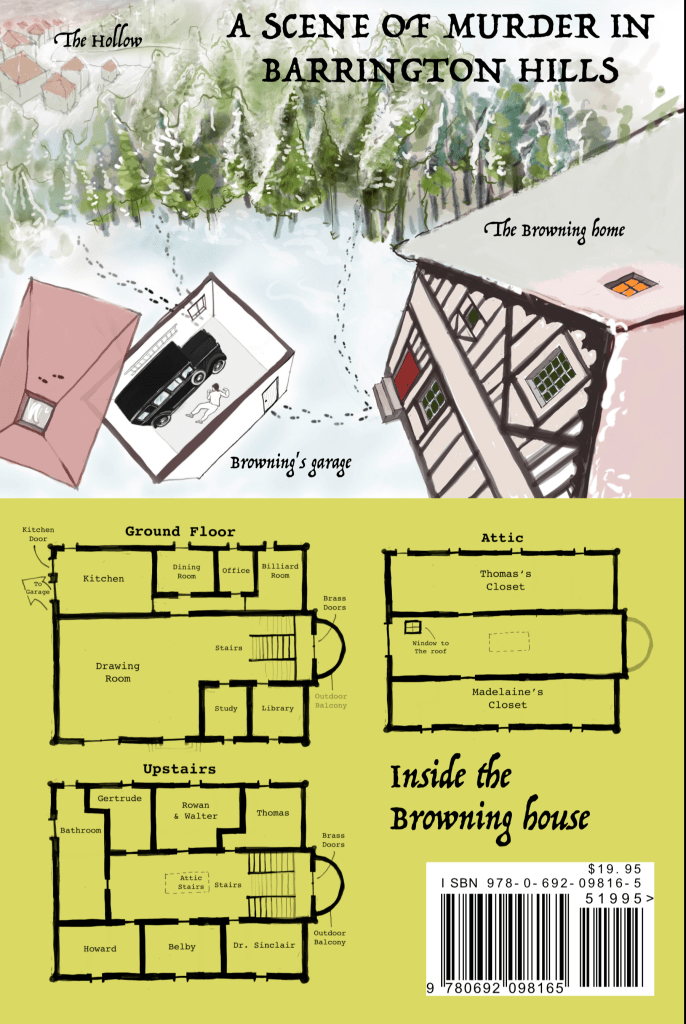
The next book was The Strange Case of the Barrington Hills Vampire (2020), The cover was meant to convey a horror-mystery.
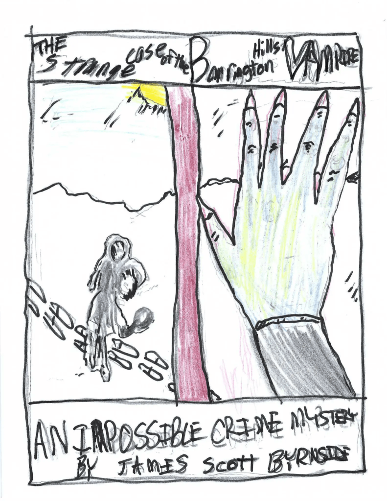
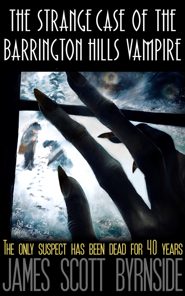
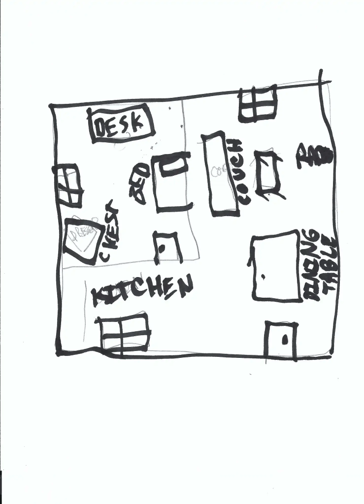
This was my first attempt at a mapback.
The design of these three books matched. And I imagined having 10 books on the shelf making a perfect block of black and grey with my name and the titles in the same font. But that didn’t happen.
It was the time of covid and uncertainty and I found myself writing a fever-dream piece of pulp called The 5 False Suicides (2021). It wasn’t anything like what I’d written before, so the style had to change.
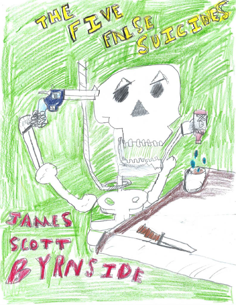
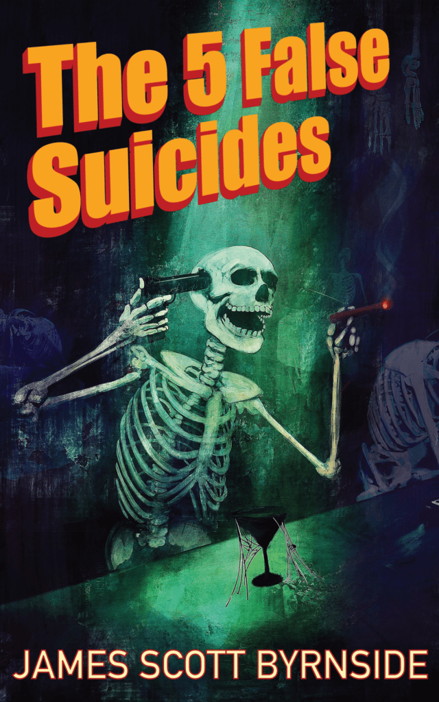
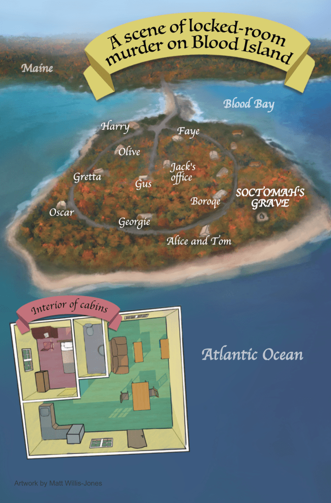
This was as elaborate as I could get. It’s the skeleton of groucho marx in an underwater bar for the dead. And the mapback is absolutely gorgeous. This is Matt’s best work by far. I certainly didn’t make it easy for him.
In 2022, for the first time since I began, I didn’t publish a book from January to January. I don’t remember exactly why, but I do remember feeling shitty about it.
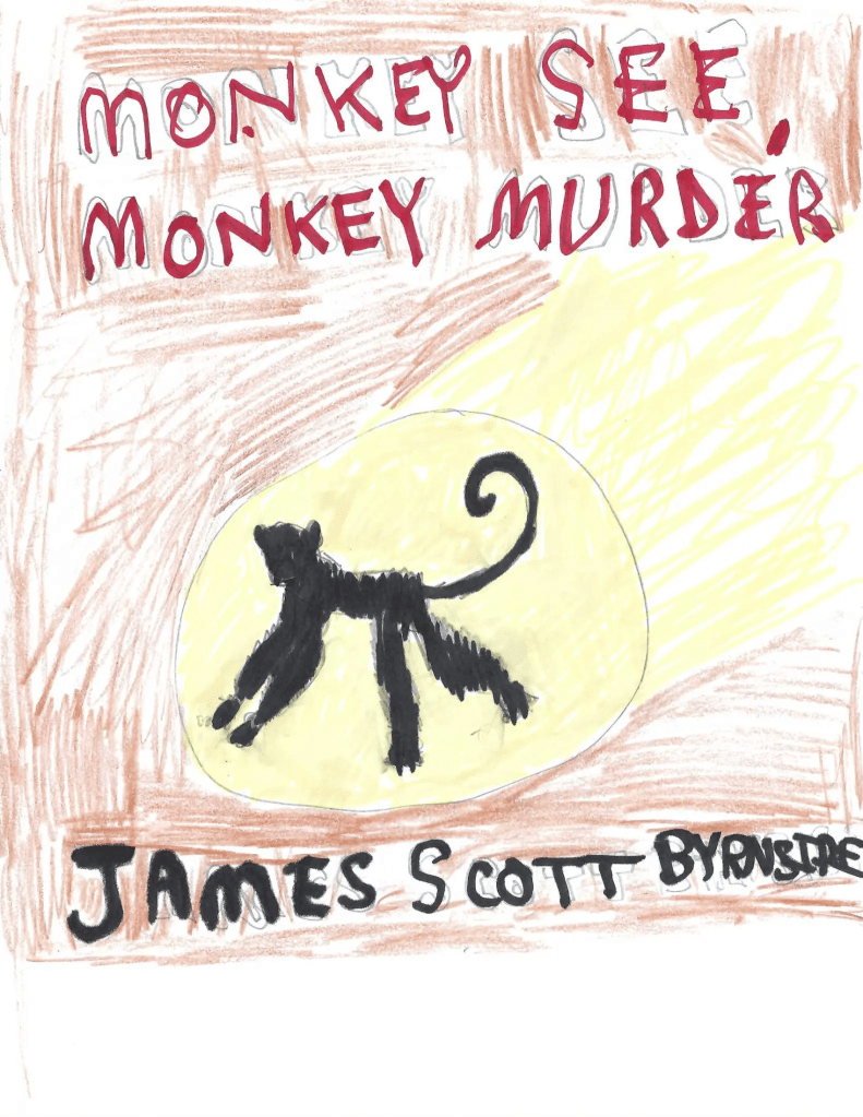
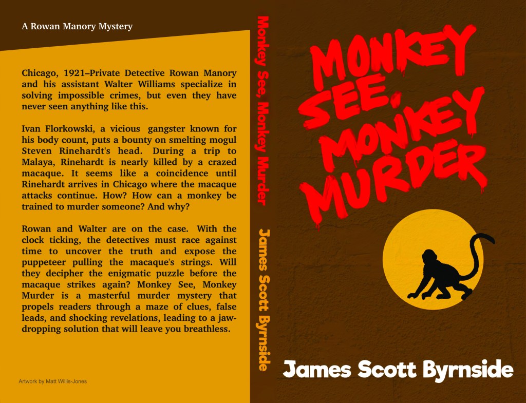
In 2023, I published my most noirish and comedic book to date, Monkey See, Monkey Murder. The goal with this cover was to simplify. After the lavishness of Suicides, I needed some austerity on the cover. The graffiti was inspired by X-Men dystopian comics and Terry Gilliam’s 12 Monkeys (1995). I wanted a spotlight effect with a monkey-on-the-loose sort of vibe. The colors of brown and yellow aren’t everyone’s favorite, but… monkeys… bananas…come on, man.
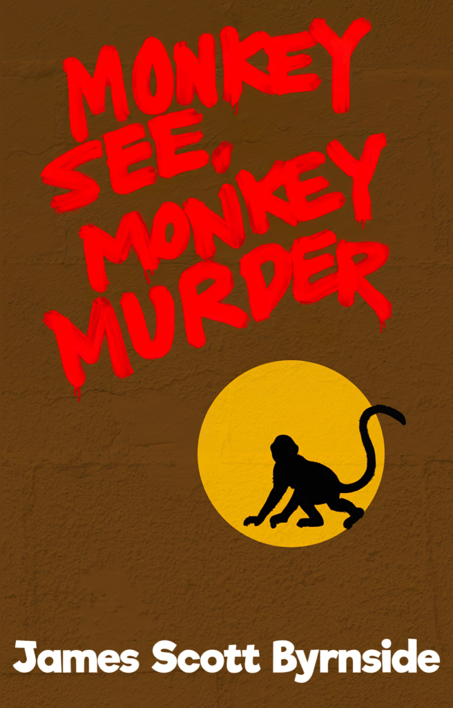
I realize you’re not supposed to use a scene from your book on the cover (according to any videos on the subject I’ve seen), but I still did it with the first three books because I thought it was cool. And I thought owning books should include the visual pleasure of the cover. But now, I found myself resigned to graphic design. Even the back, where I had been so playful before was stripped of its personality. I’m sure you’ll recognize the source of the design.
In 2024, I again didn’t publish anything, but this time it didn’t depress me. I wrote a short story for an upcoming project (more on that in due time). It was a locked-room, inverted mystery told in the first person–something I would have never seen myself attempting in a novel. I liked it a lot and found the process stimulating. I wrote and planned quite a bit in 2024, so I found it to be a productive year despite the lack of product. To make up for my sins, I published an early version of the story Silent Steps of Murder on my blog.
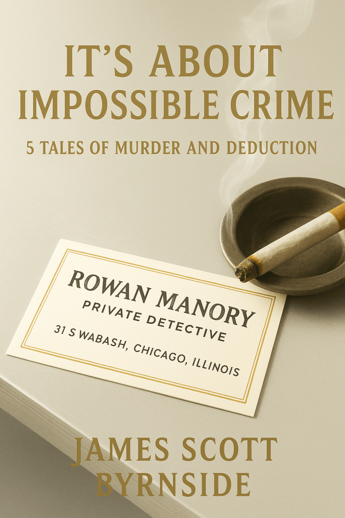
This brings us to the current year, 2025. I released It’s About Impossible Crime, an anthology of short stories. For the first time, I found myself using chatgpt to create a prototype for the cover. Also for the first time, Matt had read the material (actually 4 out of 5 stories) and had a good idea of the book’s tone and style.
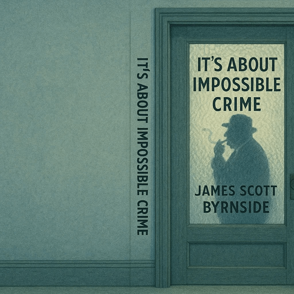
He said we should do a legacy cover. I said, “What’s a legacy cover?” He explained that it should be like an album cover and it should have something emblematic of the detectives. He suggested Rowan’s business card. I made this prototype with ChatGPT.
We liked it, but there was too much text. It was about this time, when I decided to have a wraparound cover. In this case, the back would have the window of the office and we’d see some of 1928 Chicago out the window. Naturally, the desk would have tobacco and a newspaper on it.
Then, I got a new idea and started playing around. I made this.
I liked it a lot. Matt did too — though he demanded my name be taken off the glass. We had a final meeting and he got to work.
Here’s how far he got:
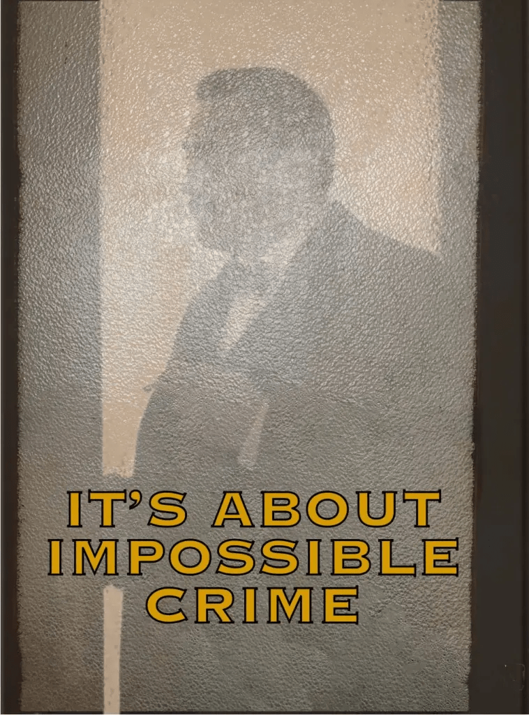
And then, as so often happens in collaboration, we couldn’t allign our schedules. I decided, for better or for worse, that I would do the cover myself.
Here, I’d like to address the use of AI for the image. I’ve seen some of the chatter about the evils of AI from designers. And I get it. Believe me. I’m an author, when I come across text that is clearly AI, it makes me want to puke. I know designers are furious at the idea that AI will take away business just as I am about writing being outsourced to the T-1000.
But here’s the thing — they would never get my money anyway. I can’t afford custom work from them and I’m not going to buy their pre-made covers. I’ve seen their pre-made covers. No way, Jose. I don’t care if they sell — none of them have the vibe I’m looking for.
Now that that’s settled, here is the exact thing I typed into ChatGPT to begin the process of making the cover. And I quote,
What I’d like is the front cover, spine, and back cover in a wraparound — when one image runs continuously on front and back. On the front, I want the door to Rowan’s office. The door is 20s style — stained glass with letters sticking to the glass. Through the glass, we can see Rowan’s silhouette. He is smoking. He is short and fat. He wears a suit and a 20s style hat. The rest of the image is the door and the wall of the building. On the spine and the back, the wall of the third floor continues. There is nothing but the wall, but we should see some wall texture — 20s style. Maybe there is a baseboard–normal texture for a 20s building. As for color — blues and greens. Similar colors. Obviously, the stained glass isn’t colored. I think the glass should be distorted — I don’t know what you call it, but glass that doesn’t allow a perfect view inside. I think it’s got knots and a textured surface that makes the image inside not so clear. – Manory’s silhouette should be proportional to the door – like he’s standing inside, 10 feet from the door. Finally, the image should be to the right, like the book has been opened and our view is the back cover to the left, the spine in the center and the front cover on the right. There is no text on the image — no title, no author’s name.
After this came a little back and forth over small details. I got an image I wanted and went to Canva, where I uploaded it onto my Amazon template. For a few days, I played with fonts and colors and finally made this:
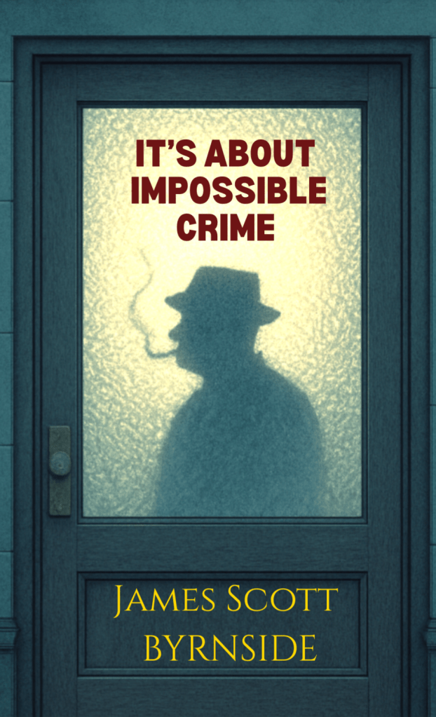
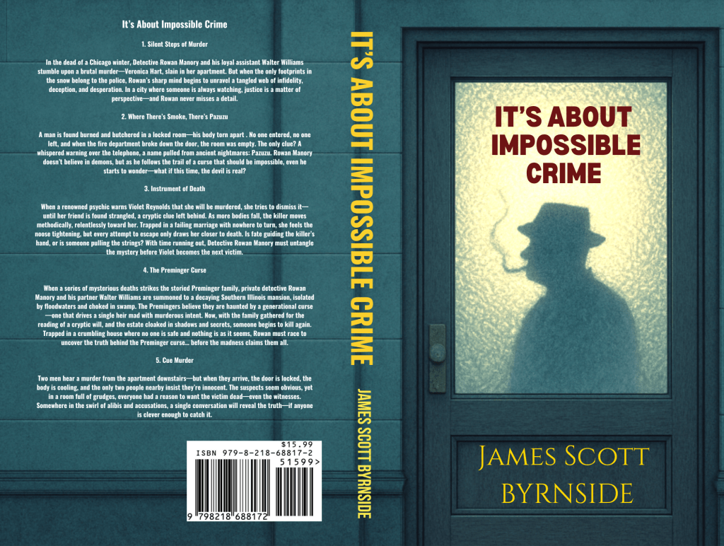
So, what do I think of it? I’m proud of myself for doing it. And I think it’s effective at telling you the genre in 2 seconds. This is my future (for now). I will be using AI to create simple covers and spending no money on them. The days of commisioning artwork are over.
As for writing. I’m not certain. Being aware of my mortality, I have to picture my future with my foresight than I had in my youth. At some point, I wanted to learn a trade and vanish into nature. This book was supposed to be a sort of last gasp. Not that it would be my final book, but it might be the final one for a while. And at some point, I would pop up with another.
And yet…
It wasn’t long after I published when I began to think of another story. And now, it appears, I’m writing it. I believe I may be writing Volume 2 of It’s About Impossible Crime. Maybe not. Perhaps, I’ll write this story and just publish it on my website and then proceed with disappearing.
I just don’t know. You can’t plan everything. After I wrote my first book, I planned on getting rich and buying a mansion with a secret passage where I’d write murder mysteries until I died. The only part of that plan wth any truth involves me dying. So, I will take it one story, nay, one impulse at a time.
Thanks to everyone who’s bought my book. If you haven’t, you can do so here — https://mybook.to/VnDBEt Leaving a review and recommending the book to others would make my day. As always, thank you for the support. And long live the impossible-crime murder mystery.
Ciao

If you really want a free cover just do like A. Carver does. You can probably find a good fair use image without using the plagiarism machine. And if you’re concerned about money, I’d start with looking into whether Meta stole your books from a book piracy site to train their machines, as has happened to countless self-published authors. (In fact, I checked myself. They stole The 5 False Suicides and Monkey See, Monkey Murder).
I’ll be honest, I hate AI art. I just think it looks weird and bad. Looking at it reminds me of all the people I’ve seen who think about giving up art entirely, but it also makes me think about the time I couldn’t sleep because I was busy crying, worried that I’d wasted four years getting a degree I couldn’t use. But even without all that baggage, I just don’t get any joy from looking at it.
I previously have chosen not to buy books because they have AI covers. It’s not even a moral statement, I just don’t want to look at that cover every time I open my Kindle. I enjoy your work enough that I might make an exception, but I do think you should reconsider your stance. This is the most important time for creatives to stick together and emphasize our shared value, because these corporations don’t value you at all. They have already proven they will steal books to support their bottom line. If you don’t want to spend money on covers, that’s fine, but genAI is not your only option.
LikeLiked by 2 people
Thanks for the thoughtful and honest comment. I completely respect your perspective, and I know a lot of artists and readers share your feelings about AI-generated imagery. This isn’t a space with easy answers, and I’m not here to try and change your mind — just to offer my own reasoning.
For me, the decision to use an AI-generated image for the It’s About Impossible Crime cover came after some trial and error. I’ve worked with fair-use and public domain imagery before, but the results weren’t satisfying. In this case, the generated image gave me exactly the aesthetic I was hoping for — and then I spent several days working on the design elements (font, layout, contrast) myself through Canva. In other words, it’s still very much a hand-built cover. It just started from a tool that happened to work for what I wanted.
As far as the ethical concerns go — I hear you. And I appreciate the reminder that this is a crucial time for creatives to show solidarity. That said, I’m frankly much more worried about piracy in the traditional sense — I’ve seen my books show up on free download sites, and it’s disheartening. Meta scraping my work to train a model stings too, of course, but if I’m being honest, it doesn’t hit as personally as people outright downloading my books without paying. And I realize that might not be the right hierarchy for everyone, but it’s how I feel right now.
You also raise a great point about covers — and that’s something I’ve wrestled with too. My books don’t show up in bookstores, and most of my readers find me through blogs, reviews, or word of mouth. For The Five False Suicides, I think the paperback cover helped a bit, but otherwise, I don’t see the cover playing a huge role in reaching readers. These days, I don’t really care about having a “cool” cover — I just want something that doesn’t look hideous, that feels appropriate to the book, and that doesn’t eat up time and money I could spend writing. A few years ago, I would have said something different, but my focus has shifted.
All of that said: I totally understand if an AI cover is a dealbreaker for you. I genuinely appreciate that you’re still considering reading the book — and I respect the line you’ve drawn for yourself.
LikeLiked by 1 person