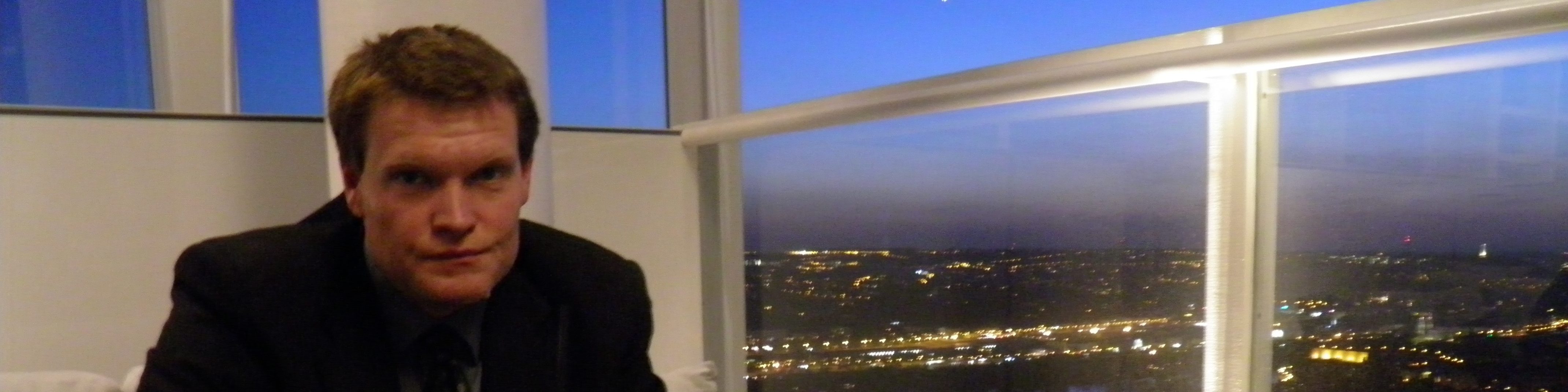
I'm a murder mystery/impossible crime fanatic and author. I like locked rooms, footprints in the snow, missing murder weapons, and unreliable suspects.
View all posts by jamesscottbyrnside
3 thoughts on “Early cover idea”
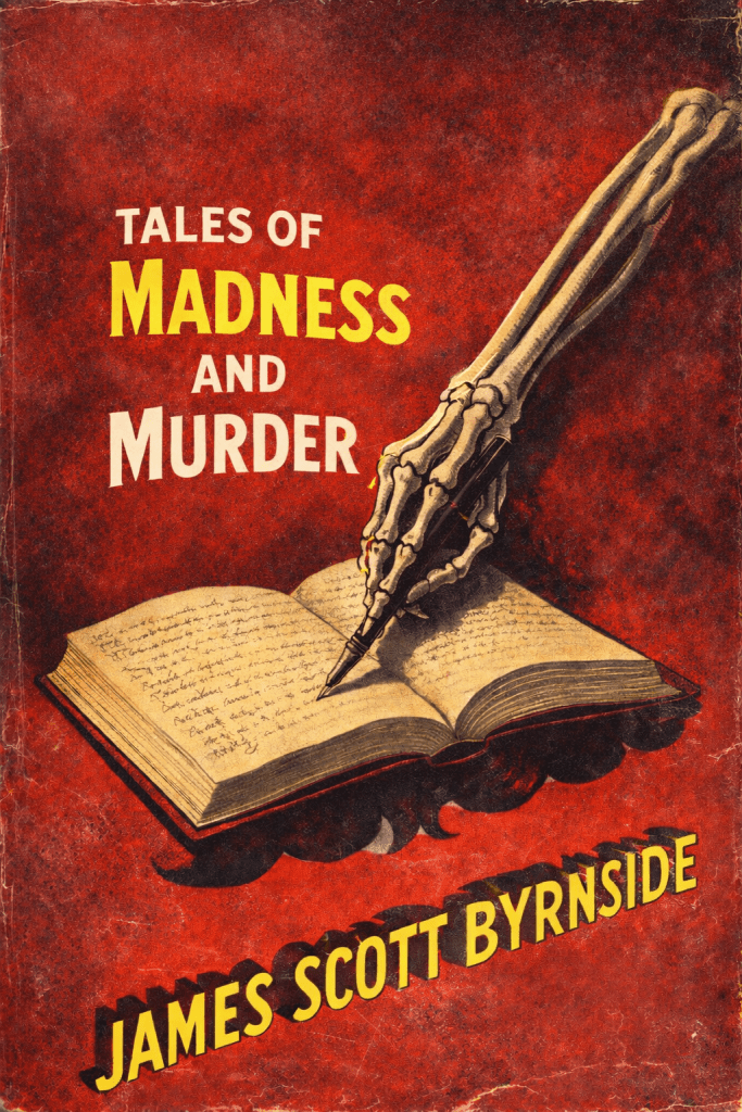
I kinda love it. Gives vibes of vintage Dell crime covers.
I kind of like it a lot too — but the title “Tales of Madness and Murder” needs to be moved up a smidgen or two — the balance is a bit off otherwise. And a bit to the left and then move the arm a bit to the left as well. Just the balance. Also, a little confused by the design under the book that appears to be not part of the book? Not sure what that is? Maybe get rid of that and move your name up a smidgen (or two). And why not make the word Murder in yellow as well? OK, feel free to ignore any or all of this — I just did too much copyreading and proofing of catalogs in my day…
This is very early. Thanks for the tips though. If I use this basic design, I’d probably leave the height of the title and crop the top — it’s very top heavy with negative space. I’m mostly fond of this shade of red and the scuffing. One of my problems with covers is making them too busy. I like the simplicity of this. But yeah, it needs a lot of work.

I kinda love it. Gives vibes of vintage Dell crime covers.
LikeLiked by 1 person
I kind of like it a lot too — but the title “Tales of Madness and Murder” needs to be moved up a smidgen or two — the balance is a bit off otherwise. And a bit to the left and then move the arm a bit to the left as well. Just the balance. Also, a little confused by the design under the book that appears to be not part of the book? Not sure what that is? Maybe get rid of that and move your name up a smidgen (or two). And why not make the word Murder in yellow as well? OK, feel free to ignore any or all of this — I just did too much copyreading and proofing of catalogs in my day…
LikeLike
This is very early. Thanks for the tips though. If I use this basic design, I’d probably leave the height of the title and crop the top — it’s very top heavy with negative space. I’m mostly fond of this shade of red and the scuffing. One of my problems with covers is making them too busy. I like the simplicity of this. But yeah, it needs a lot of work.
LikeLike